Optimizing Your Custom Flags Design to Capture More Attention
Every day, people drive their daily commute to work, school, and stores – or just drive around the city to explore. They pass by hundreds of businesses, yet they may never know about your company or that it’s even there.
Any business or company should invest in custom flags or signs and learn how to design flags that attract attention. These types of products are an easy and effective way to increase the visibility and conspicuousness of your storefront! Whether you’re looking for flags for restaurants, car washes, auto dealerships, or festivals, the custom flags that we design are vibrant and daring, which will quickly attract the attention of just about anyone. Those potential customers who drive or walk by every day will remember your business simply by the design of your flag. Wondering how to make a custom flag and grab the attention of your potential customers? Let’s dive in.
Our Tips on How to Design Custom Flags

Legibility and Design
The design/layout of your flag is the key! When coming up with your feather flag ideas, you’ll want to make sure the legibility of your flag relates to a viewer’s ability to understand the symbols, logos, and lettering. Also, consider how clearly a flag can be seen and read by those driving by with normal vision. For example, if the speed of traffic is 45mph, the minimum required legibility distance of a flag is around 360ft (110m). So, it’s more effective to keep the message on your custom flag as simple as possible.
Keep in mind that what is readable on a sheet of paper or computer screen is not typically transferred to a custom flag. When learning how to design your flag, you want to make sure that the fonts, sizing, space, colors, and so on are easy to understand when quickly driving by. To choose the right font type, you want to avoid serifs, script, texture, etc. When it comes to how to design a flag, you typically want to stick with a Sans Serif font that has a thick simple appearance; for example, a few popular typefaces would be Futura, Apercu, Gotham, Circular, and GT Walsheim.
Sizing and Location
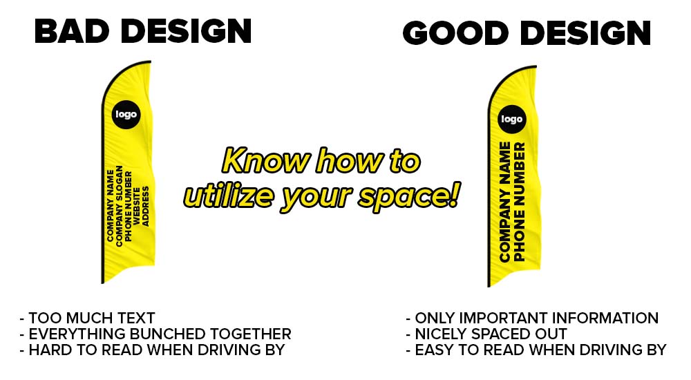
You want to avoid putting too much text — it will make your flag look very cluttered, which can confuse the customer. It’s best to maintain a clear and upfront message. Your custom flag should be visible to a person walking, driving, or standing. It is important to make sure that your potential customers have a chance to react to the sign when they see it.
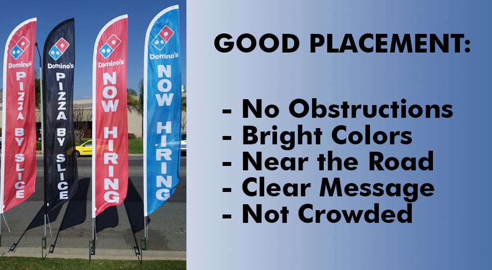
Once you’ve learned how to design a custom flag, the next step is the visibility of the sign. The placement or location of your flag plays an important role! The physical appearance of your business location will determine the location, the type, and the size of a flag you should have. From custom 3×5 flags to rectangle flags and vinyl banners, you’ll find your perfect flag type at Feather Flags. Prioritize the information you need to communicate; for example, simple sayings such as sales, clearance, event, or just a simple logo with your slogan will do just the job.
These tips do not only apply to just custom flags – all of your signs should take them into consideration. Remember, sometimes less is more. Keep your signage straightforward, to the point, and readable. At the end of the day, one properly designed sign will outperform ten poorly designed ones. Next time you are thinking of how to make custom flags, assume your clients will be driving by at high speeds, only allowing them seconds to read your advertisement.
Have more questions about how to design a flag? Contact us! Send us an email at sales@featherflagnation.com or give us a call at 1 (877) 900-5692. We are open M-F from 8am-4:30pm PST.


