In the realm of advertising, the use of color is a powerful tool that can significantly influence consumer behavior and perception. Outdoor advertising, particularly through flags and banners, leverages this aspect to capture attention, evoke emotions, and convey brand messages effectively. The psychology of color in advertising is rooted in how different hues can trigger specific feelings and responses, making it crucial for marketers to understand and utilize this knowledge. In this post, we will explore the fascinating interplay between color and consumer psychology, offering insights on how to create the most compelling and impactful outdoor signs using flags and banners.
Understanding Color Theory for Advertising
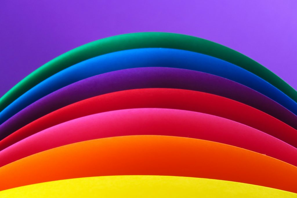
Color theory is all about how colors mix and work together. It helps us understand which colors look good together and how they can make people feel. The color wheel shows us the relationships between colors. For example, colors opposite each other on the wheel, like red and green, are called complementary colors. They create a strong, eye-catching look. Colors next to each other on the wheel, like blue and green, are called analogous colors. They create a more calm and peaceful look. Knowing these basics helps make outdoor ads, like flags and banners, look great and catch people’s attention. This understanding is key in the psychology of color in advertising.
Colors also have meanings that can make people feel different things. For example, red can make people feel excited or urgent, which is good for sales signs. Blue can make people feel calm and trustful, which is why many banks use it. By understanding what different colors mean, businesses can choose the right colors for their ads. This way, they can make sure their flags not only look good but also send the right message to people. This application of color theory advertising ensures effective communication and brand alignment.
The Best Colors for Psychological Advertising
Certain colors work really well for advertising because they grab attention and make people feel specific emotions. Red is one of the best colors for getting noticed as it conveys excitement and urgency. Because of this, many stores utilize red to advertise big sales or clearance events. Yellow is another good color because it’s bright and cheerful, making people feel happy. It’s often used for fun products and family-friendly events. Blue, as mentioned before, is great for building trust and calm, so many banks and tech companies use it. Green represents health and nature, which is why it’s popular with brands that focus on the environment or wellness.
Real-Life Examples

There are plenty of real-life examples that show how effective these colors can be. For instance, McDonald’s uses red and yellow in their logo and advertisements. The red grabs your attention, while the yellow makes you feel happy and hungry. Another example is Facebook, which uses blue to make users feel safe and connected. Whole Foods uses green in its branding to highlight its focus on natural and organic products. By following this color theory, these companies’ advertising creates strong connections with their customers and makes their advertisements stand out.
Why Red is a Great Color?

Red is one of the best colors for advertising because it is very powerful and grabs attention quickly. It is a color that stands out and can be seen from a distance, making it perfect for outdoor swooper flags. Red also creates a sense of urgency and excitement, which can motivate people to take action, such as making a purchase or visiting a store. Because of these strong effects, red is often used in promotions to attract customers and boost sales. This showcases the psychology of color in advertising at work.
There are many examples of how the color red is used effectively in psychological advertising. Coca-Cola is a great example, using red for its logo and branding for many years. The color red helps Coca-Cola stand out on shelves and creates a feeling of excitement and energy. Target, a popular retail store, also uses red in its logo and store signs. The red color makes Target easily recognizable and encourages people to come in and shop. Another example is YouTube, which uses a red play button as its main logo. The red color grabs attention and encourages people to click and watch videos. These examples show how powerful and effective red can be in advertising and demonstrate color theory in practice.
Always Trust in Blue
Blue is one of the best colors for advertising because it is psychologically associated with trust, reliability, and professionalism. It has a calming effect, making people feel secure and at ease. This makes blue an ideal choice for brands that want to build a sense of trust and stability with their customers. Blue is also versatile and widely accepted, which means it can be used in a variety of industries, from technology to finance. Its calming and trustworthy nature makes blue a popular choice for businesses looking to create a strong, dependable image.
There are several successful examples of brands using blue in their color theory advertising. Facebook, a major social media platform, uses blue in its logo and website design to create a sense of trust and dependability, encouraging users to feel secure while sharing personal information online. Another example is IBM, a technology and consulting company often referred to as “Big Blue” due to its extensive use of the color in its branding. The blue color helps IBM convey professionalism and reliability in the tech industry. Lastly, American Express, a financial services company, uses blue in its logo and advertising to promote a sense of security and trustworthiness, which is crucial for a brand handling people’s money and financial transactions
The Soothing Green Color

Green is one of the best colors for advertising because it is associated with nature, health, and tranquility. It creates a sense of calm and freshness, making it ideal for brands that want to promote a natural and healthy image. Green also symbolizes growth and renewal, which can be appealing to consumers looking for products that support well-being and sustainability. Because of these positive associations, green is often used in advertising to convey messages of environmental friendliness and health benefits. This usage is a prime example of the psychology of color in advertising.
There are many successful examples of brands using green in their advertising. Whole Foods Market, a grocery store chain known for its natural and organic products, uses green in its logo and store design to emphasize its commitment to health and sustainability. Starbucks also uses green in its logo, which helps convey the idea of relaxation and a connection to nature, enhancing the coffee shop’s inviting and calm atmosphere. Another example is John Deere, a company that makes farming equipment. The green in its logo and machinery highlights its connection to agriculture and the outdoors, reinforcing the brand’s identity and trustworthiness in the farming community. These examples show how green can effectively communicate a brand’s values and attract customers who care about health and the environment.
How to Choose Your Preferred Colors By Industry
Choosing the right colors for your advertising depends on the industry you are in and the emotions you want to evoke in your audience. For example, in the food and beverage industry, red and yellow are popular because they stimulate appetite and create a sense of urgency. In the health and wellness sector, green and blue are often used to convey calmness, health, and trust. Technology companies frequently use blue to signify trust and professionalism, while eco-friendly brands lean towards green to emphasize sustainability and natural products. Understanding the common color associations within your industry can help you select colors that resonate with your target audience and effectively communicate your brand message, leveraging the psychology of color in advertising and the principles of color theory advertising.
Feather Flag Nation Is Here to Help
vinyl banners, and custom inflatable tube men, helping businesses attract attention and convey their message effectively. With expertise in design and color theory, these advertisements ensure each one not only stands out but also aligns with your brand’s image and goals. Whether you need vibrant feather flags for a grand opening, sturdy vinyl banners for promotions, or playful inflatable dancing tube men to draw in crowds, Feather Flag Nation offers high-quality, customized solutions to make your business more visible and memorable to potential customers, applying the psychology of color in advertising to create impactful designs.
Ready to start your design process? Submit your free design request now!
