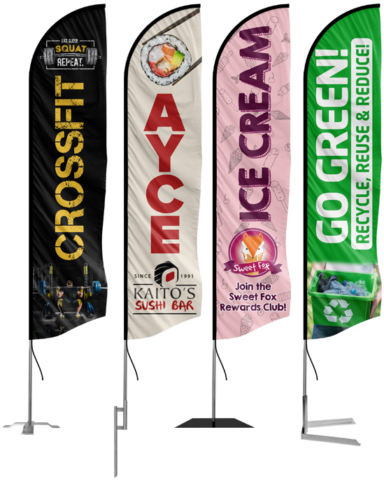
Designing Your Feather Flag
Less is more. This isn’t a new concept, but it is one you should be implementing when designing your feather flag. Sometimes having your name, logo, phone number, address, specials, and deals sounds like a good thing to have on your flag, but that can quickly get too difficult to read. Feather flags should be designed with simple and concise messages that will be easy to read when walking and driving by.
Outdoor signage should be simple and to the point. Why do you ask? The average driver spends about 3-5 seconds looking at signs on the road. That means you have 3-5 seconds to make an impact. If your flag has a ton of information, people driving by won’t be able to read it all and will miss out. Large, bold text and one to two words are usually ideal when designing a feather flag. Let’s talk about the different elements that make for good feather flag designs.
Text Size
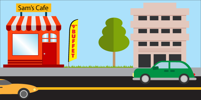
A good rule of thumb with text size is 1 to 10. For example, if the letters of your word are 1″ tall, they can usually be viewed from 10ft away. Our in-stock and custom feather flags have a width of 2.5ft, which can allow for large text. If the word you’re using is about 4-5 letters long, you can make the text as high as 35-45″. This can allow for visibility up to 350-450ft away. So remember, 1 to 10!
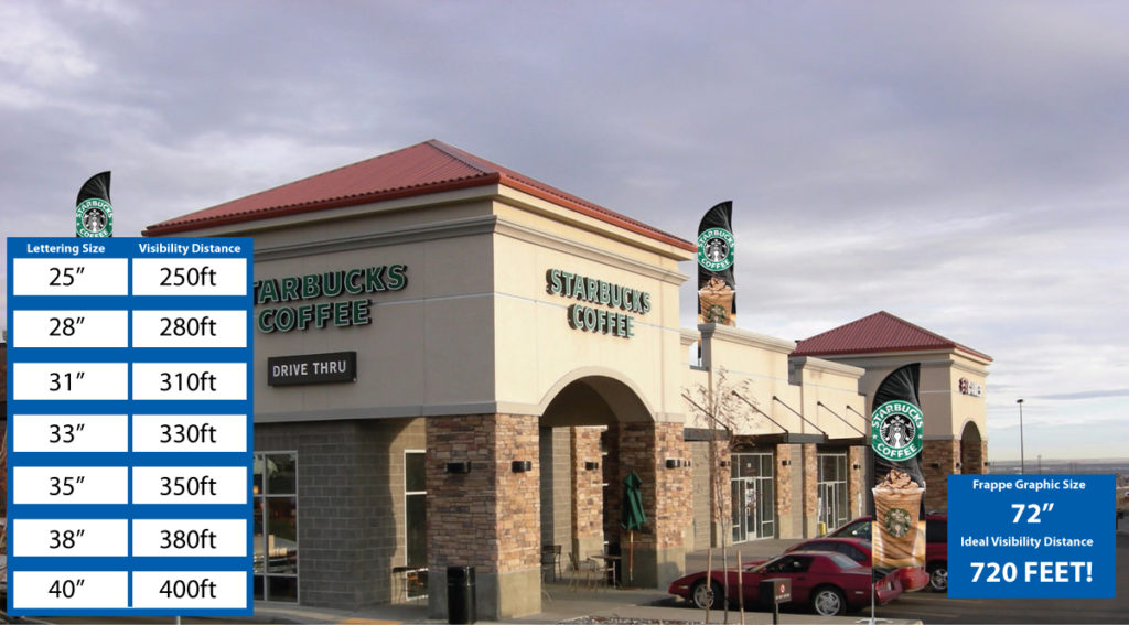
Examples of Font Sizes
The bigger the font, the easier it’ll be to read. Ideally, you want your text to be as easy to read as possible. We usually recommend not using words over 10 letters long. Our in-stock feather flags tend to use 1-3 words and each word is 10 letters or less. Stock flags are a great way to see what works on flags. This can help you when designing your flag. Your designer will also work with you to make sure your flag is perfect, so if you’re having trouble, just ask!
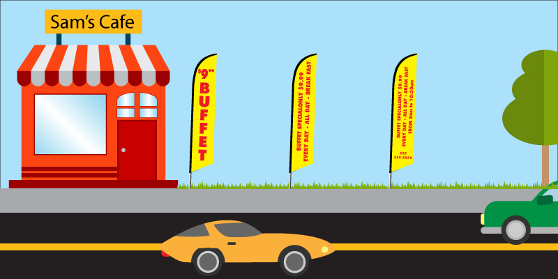
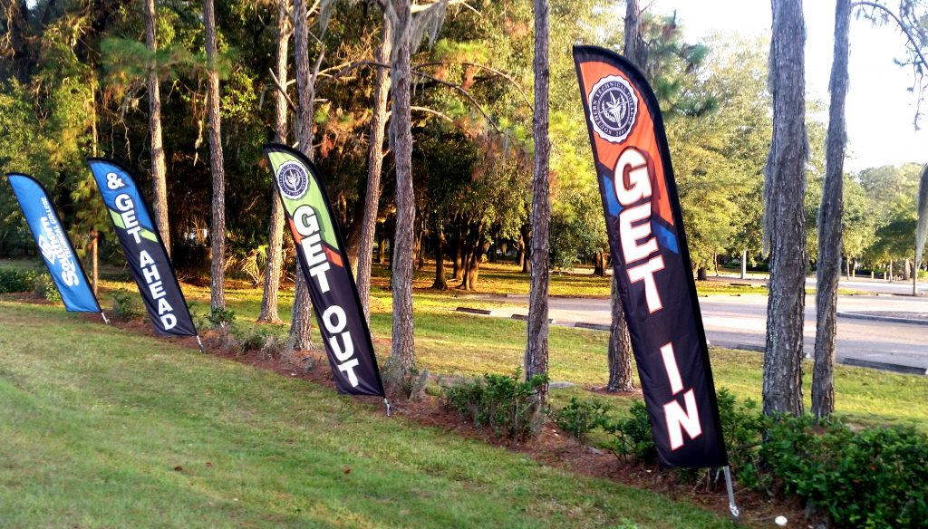
The below image is a great example of how too much text can hinder your flag. The two flags on the right have more information than the one on the far left, but they’re significantly harder to read from a distance. Keeping your flag to 1-3 words tends to work best.
Feather Flag and Font Color
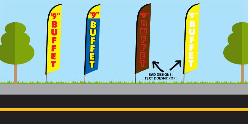
Flag color and font color go hand and hand. You want to choose colors that have a good contrast to them. This will help the text on your flag pop and make it even easier for people driving by to read it. Bright colors tend to work the best. With our in-stock feather flags, you primarily see yellows, blues, and reds being used as these colors contrast best and are easy to see from a distance.
The most popular color combinations we see are blue/red, blue/yellow, yellow/red, blue/white, red/white, and green/white. Of course, with custom flags, you get to choose your colors so they can be whatever you’d like. Your designer will let you know if they have a better suggestion for your colors.
The two flags on the right are examples of colors that don’t pop. The colors on the flags are very similar, not allowing for the message to stand out as much as it does with the flags on the left.
Font Type
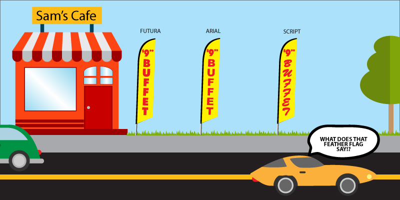
Another thing you want to keep in mind when designing your flag is what font type you’d like to use. Script fonts may look cool, but they’re almost always too difficult to read to be used on a feather flag. Script fonts can be very difficult to read if you’re driving by as you won’t have time to fully take in the message. Popular fonts we use here at FFN are Arial, Futura, Helvetica, and Proxima Nova. Of course, you can use whatever fonts you’d like, but if you don’t provide a specific font, your designer will likely choose one of these.
Looking at the image below, you can see how a script font is significantly harder to read than the other two sans serif fonts. If your text is going to be vertical like the below image shows, script fonts are especially not recommended.
Feather Flag Placement
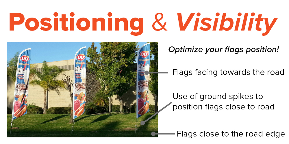
The last thing you want to consider is the placement of your feather flag. If your flag is near trees, power lines, etc, it could snag and rip. Also, the more things around the flag, the less likely people will see it. You want to maximize your sign’s visibility as that will directly affect how many people see your flag and thus how much more business you get.
If you’re in a busy location and just want to make sure people know you’re there, use your flags in different locations that can be viewed from the road (on fences, the part of your building that is seen from the road, rooftop, entryway, etc). The beauty of using feather flags is you can move them around whenever you want to. Unlike billboards, you can adjust the position of your flag so you know it’s getting seen.
Conclusion
These principles are straightforward and easy to implement. Following them will ensure that your custom feather flag is the best it can be. Remember: less is more. For outdoor signage, heavy amounts of text just won’t work. Keep your message short and sweet and start bringing in those sales! We offer free design services and are here to help you design the perfect flag.
Have additional questions? Contact us!
REQUEST A DESIGN NOW & GET FREE SHIPPING
