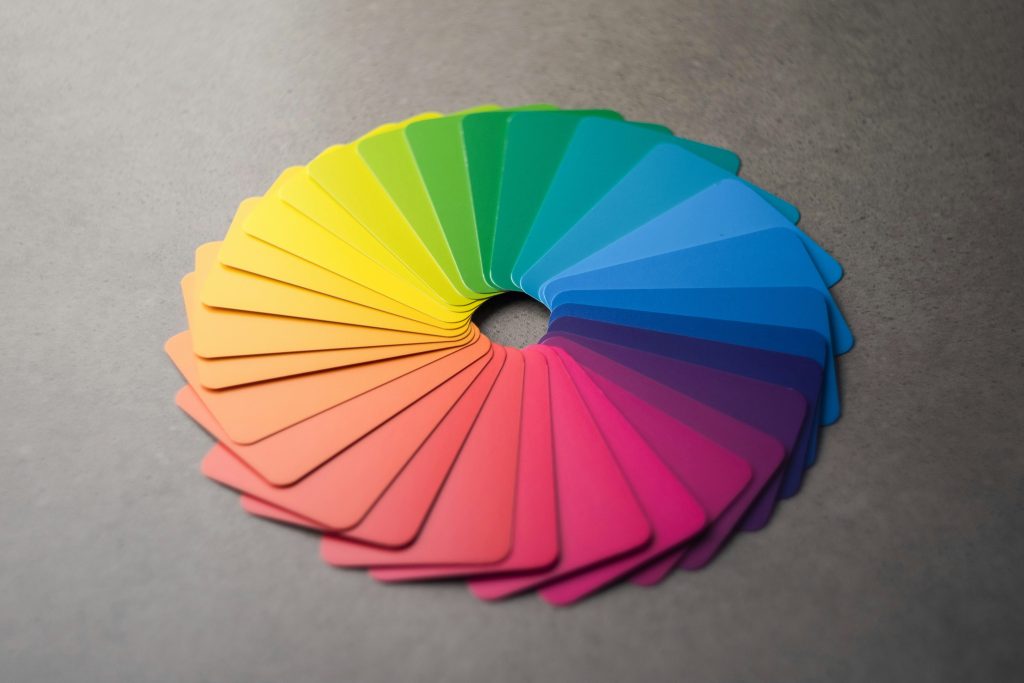
Choosing the best colors for your banners is one of the most important decisions when designing your feather flag. The colors you use can grab people’s attention and make your message stand out. This is why picking the best colors for advertising is so crucial. But how do you know which colors to pick, and how many should you use? It might seem confusing at first, but with a few simple tips, you can create a design that is eye-catching and effective.
In this blog post, we will walk you through the best colors for advertising on feather flags and guide you on how many colors to use in your design. By the end, you’ll have a clear understanding of how to create a custom flag that stands out and gets results, without being too complicated. We’ll also share three easy-to-follow feather flag design ideas to help you start creating your own custom feather flag signs.
Colorful Feather Flag Design Ideas
There are many feather flag ideas to explore, but we’ll focus on three simple and effective approaches. First, we’ll talk about why bright colors work best. Then, we’ll explain how using your brand colors helps create a strong identity. Lastly, we’ll show you how sticking to just 2 or 3 colors can make your design clear and easy to read. These tips will help you create custom feather flag signs that stand out in any crowd.
Use Bright Colors for Maximum Attention
When it comes to outdoor advertising, bright colors are one of the best colors for advertising because they catch people’s attention quickly. Imagine walking or driving by a feather flag that is bright yellow or red – it’s hard to miss, right? These bold colors stand out against the background and naturally draw the eye.
Here is a breakdown of the psychology of advertising colors: Bright red is often used for sales or clearance events because it signals urgency. Yellow, on the other hand, makes people feel happy and energetic, which is great for promoting upbeat events like festivals or parties. Orange is another strong choice for catching attention and is often used for advertising food or outdoor events. All of these colors work so well because they are easy to see from a distance, especially when used on custom feather flag signs.
However, you don’t need to go overboard. Stick to one or two bright colors to make your feather flag pop without overwhelming the viewer. Using too many bright colors together can be distracting, so it’s best to keep it simple.
Use Your Brand Colors

If you want to create a strong, consistent look, using your brand colors is a great idea. Incorporating brand colors into your feather flag design helps people recognize your business right away. This strategy not only keeps your advertising consistent but also builds trust with your audience.
For example, if your brand’s main colors are blue and white, using these colors on your feather flag reinforces your brand’s identity every time someone sees it. Think about popular brands like McDonald’s with their red and yellow or Coca-Cola with its iconic red. These colors are easily recognized because they are used consistently in all forms of advertising.
Using your brand colors makes your custom feather flag signs feel professional and helps people associate the flag with your business. It’s a smart choice for companies looking to build long-term recognition with their audience.
Stick to 2-3 Complementary Bright or Brand Colors
Simplicity is key when it comes to feather flag design ideas. Sticking to just 2 or 3 complementary colors is often best for your advertising to keep your design clean and easy to read. Complementary colors are pairs of colors that look good together, like blue and orange or purple and yellow. These color combinations are pleasing to the eye and help make the text or logo on your feather flag easy to see.
For instance, using blue and white is a great combination for creating a calm and professional look, while pairing red and black gives a bold and powerful appearance. When you limit yourself to a few colors, you ensure that your message doesn’t get lost in a sea of color.
Not only does this approach help your flag look clean, but it also improves readability. If your feather flag is too colorful or busy, people passing by might not be able to read your message clearly. Simple designs with just 2-3 colors are easier on the eyes and more effective at getting the message across.
Start Designing With Feather Flag Nation
Picking the best colors for advertising and deciding how many to use doesn’t have to be complicated. By following these simple tips, you can create a feather flag that grabs attention and clearly communicates your message. Whether you choose bright colors, stick to your brand’s palette, or limit yourself to 2-3 complementary colors, each of these feather flag design ideas will help you create an effective flag that stands out.
Remember, less is often more when it comes to design. Keep your colors simple, and your message will shine!
Stuck on the best colors for your banners and not sure what to do? Send the Feather Flag Nation team your brand guide and your event details. We’ll help you create the perfect, yet simple, design to make your next sale or event a success.
