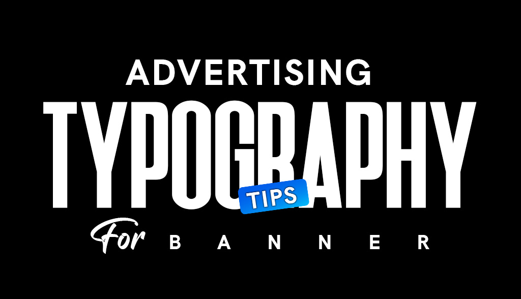
Typography plays a pivotal role in advertising, especially when it comes to creating eye-catching banners. The fonts, sizes, and styles you use can make or break the effectiveness of your message. With limited time to grab attention, using the right advertising typography ensures your banners communicate clearly and leave a lasting impression. Here’s how you can make your banner designs stand out with typography.
Understanding the Role of Typography in Banner Advertising

Typography isn’t just about choosing a pretty font—it’s about creating an impactful visual hierarchy that conveys your message at a glance. Advertising typography can enhance readability, evoke emotion, and guide the viewer’s eye toward your call-to-action statements. For banners, where space is limited and visibility is key, your typography needs to work harder to ensure your message is both seen and understood.
Whether you’re designing outdoor flag banners, custom retractable banners, or custom vinyl banners, the right choice of typography can increase engagement and drive action. By focusing on elements like font selection, scale, and placement, you can transform a simple banner into a compelling marketing tool.
Key Typography Tips for Advertising Banners
To create effective banners, consider these tips for typography:
- Keep It Simple: A cluttered banner with multiple fonts can confuse viewers. Stick to one or two complementary fonts that align with your branding.
- Example: Pair a bold sans-serif for headlines with a clean serif for supporting text.
- Prioritize Readability: Choose fonts that are easy to read from a distance. Decorative or overly stylized fonts might look great but can compromise clarity.
- Use Short and Punchy Text: Your banner should deliver its message in as few words as possible. The typography should amplify this brevity with strong, legible fonts.
- Align Text Strategically: Ensure text placement complements the overall design. Center alignment works well for headlines, while left alignment often feels more natural for body text.
- Consistency Matters: Maintain uniformity in your typography choices across banners for a cohesive and professional look.
Font Size, Scale, Color, and Contrast

Typography for banners must be designed with visibility in mind. Following key tips for typography can help ensure your message stands out effectively. Here’s how to balance font size, scale, color, and contrast to enhance advertising typography and maximize impact:
- Font Size: Headlines should be large enough to be readable from a distance. While 3 inches might work for small banners viewed from 10 feet away, larger banners, like one that is 12 feet, require proportionately bigger text. Always scale the font size according to the banner’s dimensions and viewing distance.
- Scale: Create a visual hierarchy by scaling text elements appropriately. Headlines should be significantly larger than subheadings or body text.
- Color: Use colors that contrast sharply with the background. High contrast ensures better legibility, especially in outdoor settings.
- Example: Black text on a yellow background or white text on a dark blue background.
- Contrast: Experiment with bold weights or outlines for added emphasis on important text elements like your call-to-action statements.
Text Hierarchy and Spacing

Hierarchy and spacing are crucial in directing the viewer’s attention. When done correctly, these elements guide the audience through your banner’s message step by step:
- Headline Placement: Place your main message at the top where it’s most likely to catch the eye.
- Subtext Spacing: Keep enough breathing room between text elements to avoid a cramped look. Adequate spacing improves readability and visual appeal.
- Call-to-Action (CTA): Your CTA should have the most prominence in the hierarchy, whether through bold fonts, contrasting colors, or strategic placement.
- Alignment and Balance: Maintain alignment throughout the design for a clean and organized look. Balance your text and visuals to avoid one side feeling too heavy.
Top Tips for Typography: Common Mistakes to Avoid
Even with the best intentions, poor typography choices can detract from your banner’s effectiveness. Avoid these common mistakes when implementing your typography advertising campaign:
- Overcrowding the Design: Too much text or a lack of spacing can make your banner feel overwhelming.
- Using Inappropriate Fonts: Fonts that are too decorative or hard to read can confuse viewers and diminish your message’s impact.
- Neglecting Contrast: Low-contrast text blends into the background, making it difficult to read.
- Ignoring Target Audience: Choose fonts and styles that resonate with your audience. For example, modern sans-serif fonts may appeal more to younger demographics, while classic serif fonts might work better for formal or traditional brands.
- Inconsistent Branding: Typography that doesn’t align with your brand’s identity can lead to a disjointed marketing message.
Team Up With Feather Flag Nation to Draw More Customers
When it comes to creating banners that combine stunning advertising typography with durable materials, Feather Flag Nation is your trusted partner. Here’s why:
- Customizable Fonts and Designs: Our team helps you create flag banners that feature bold, attention-grabbing typography tailored to your brand. Reach out to our design team today!
- High-Quality Materials: From custom vinyl banners to customizable feather flags, our products are designed to withstand outdoor conditions without compromising on clarity.
- Expert Guidance: Not sure which banner font ideas will work best? We’ll guide you through typography options to ensure your message is impactful.
- Affordable Solutions: Get professional-looking banners at prices that fit your budget.
Whether you’re advertising a grand opening, promoting a sale, or showcasing an event, our banner solutions help you captivate your audience and drive results.
